Brand Identity · 2025
Brand Identity · 2025
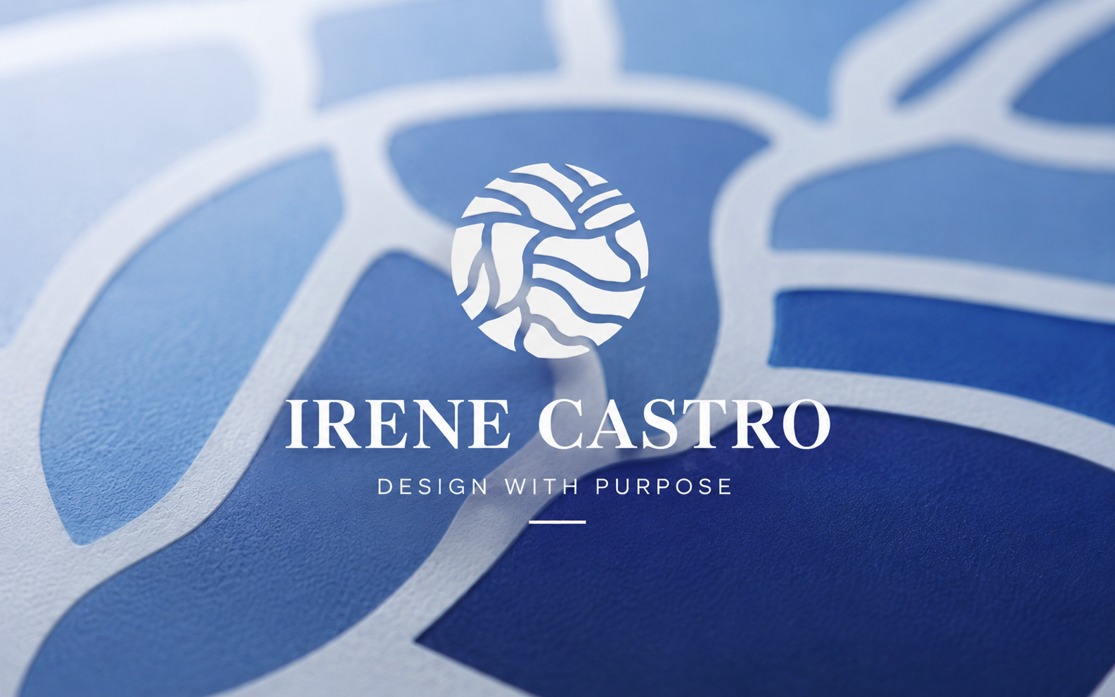
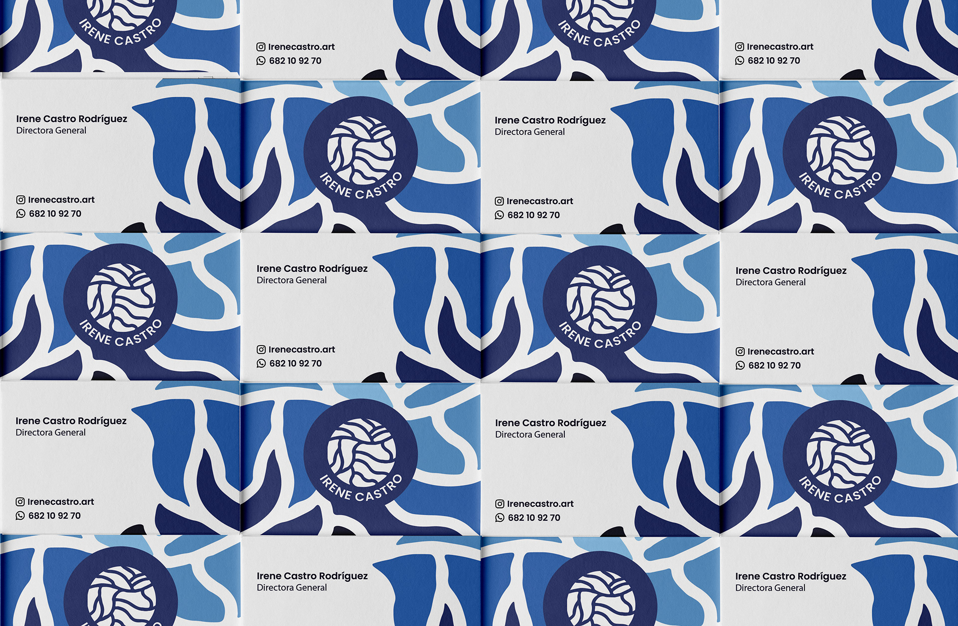
Irene Castro is a personal brand inspired by the connection between nature, the sea and the land. These three elements represent the essence of who she is and became the foundation of her visual identity.
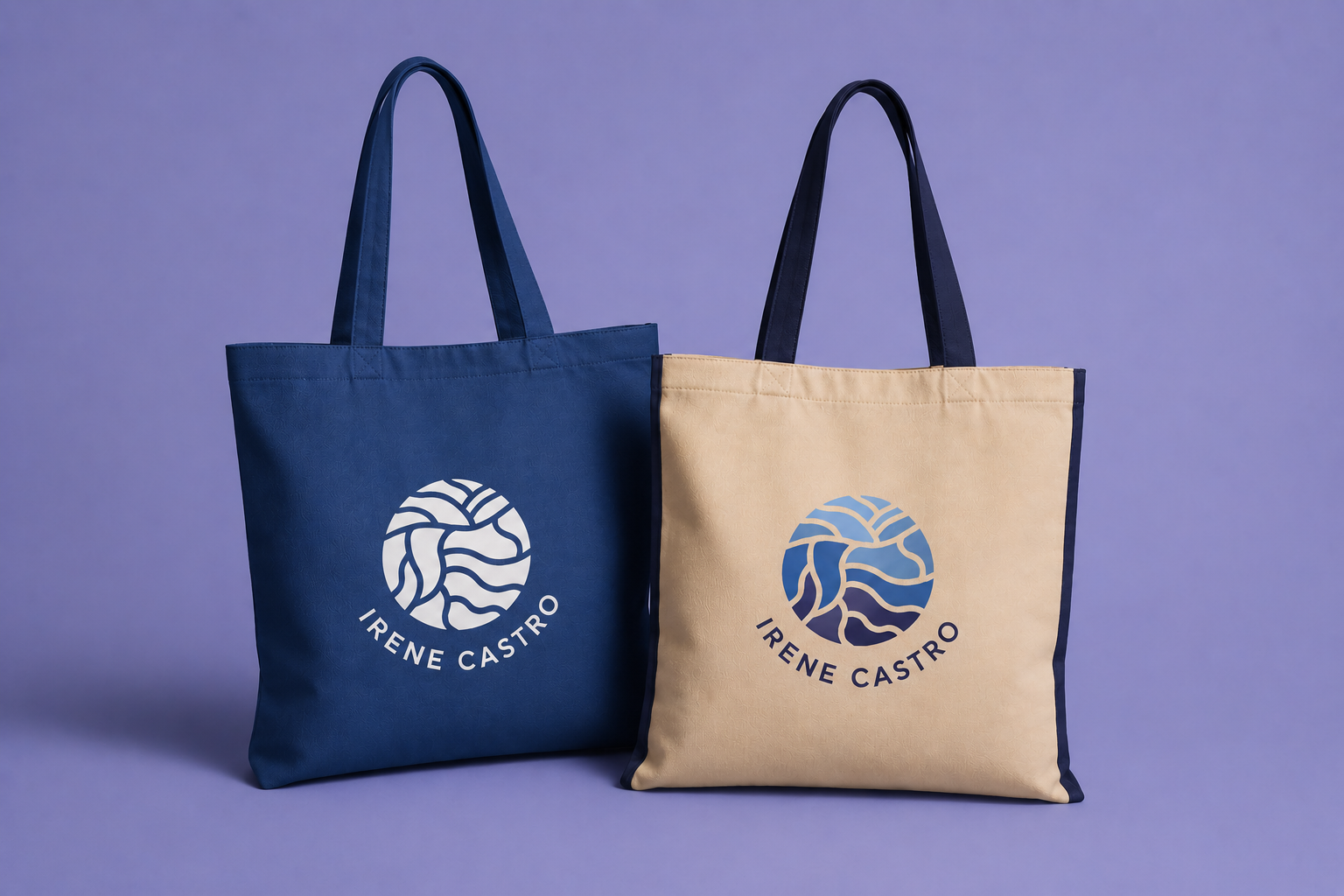
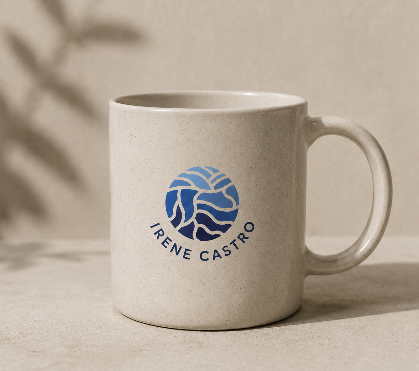
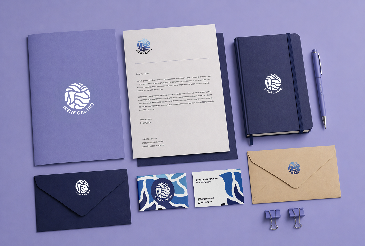
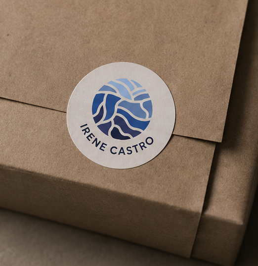
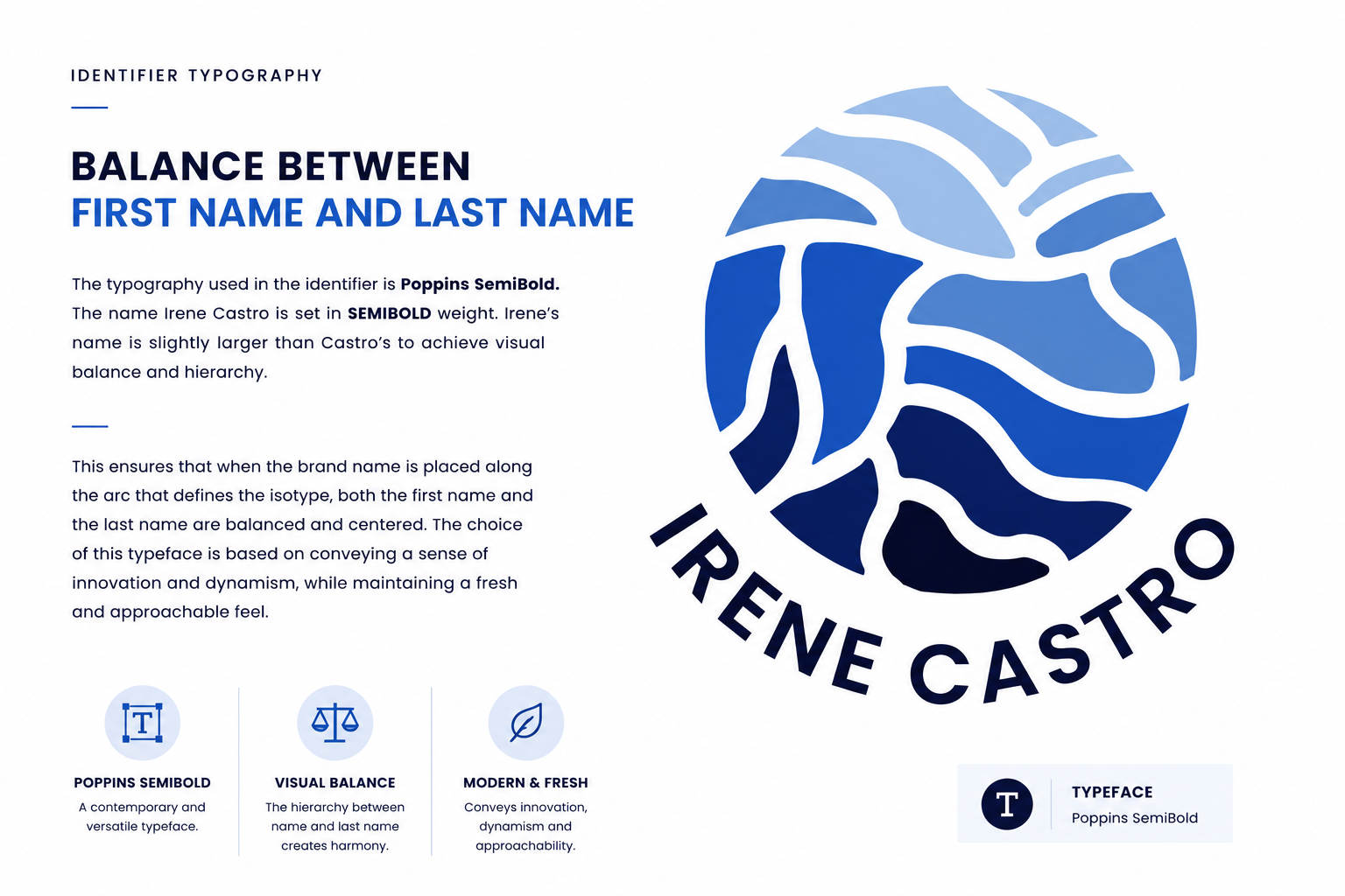
The identity system was built around an organic symbol that represents movement, roots, waves and growth — a single mark that carries the weight of the natural world without becoming decorative.
The goal was to create a visual language that feels calm, elegant and timeless while remaining highly recognizable across every application.
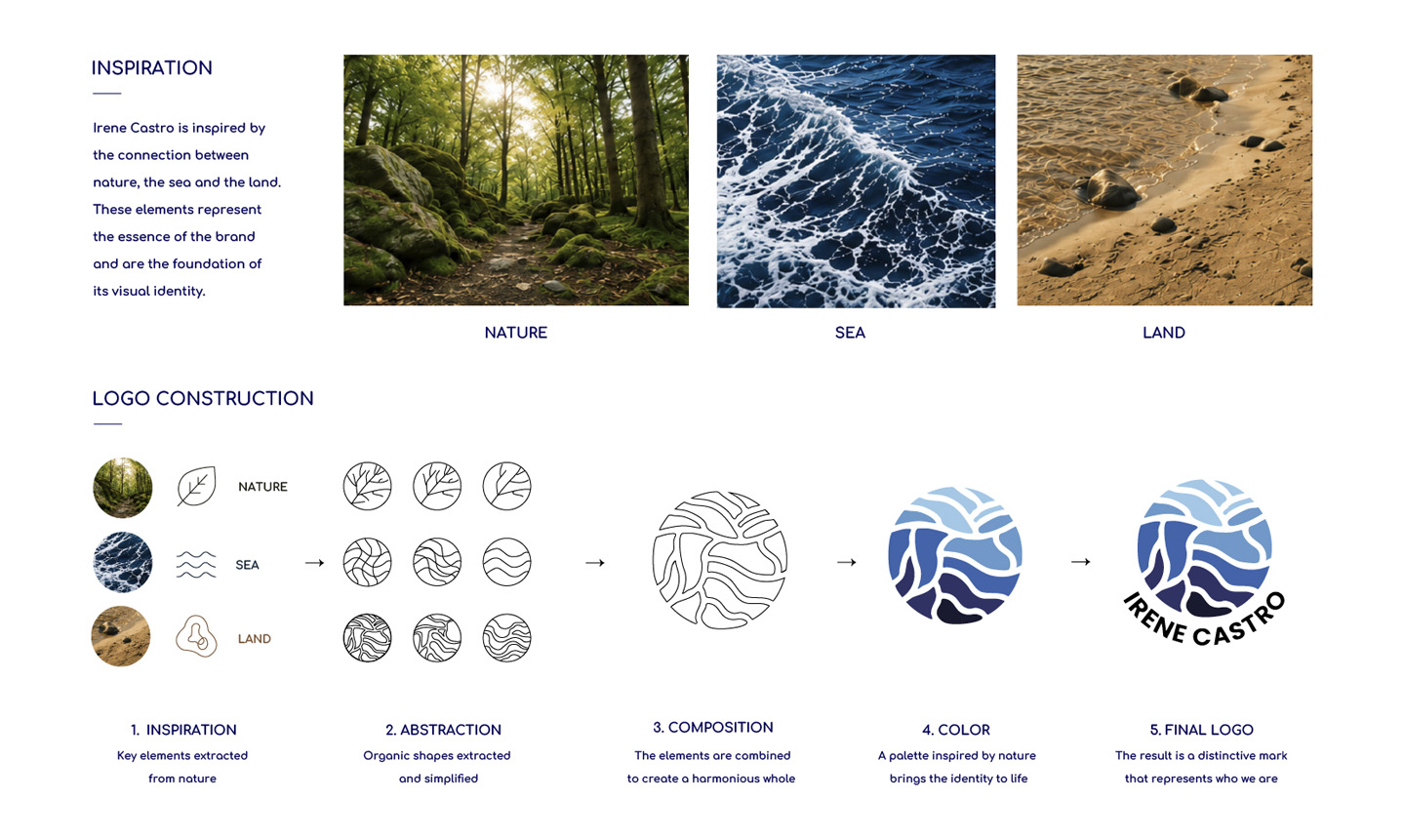
The logo was not designed — it was extracted. From the textures of sea foam, the geometry of coastal rock formations, and the organic patterns of underwater current. Three elements collapsed into one circular symbol.
Each curve in the mark can be read as a wave, a root, or a shoreline. The ambiguity is intentional. The brand feels universal without being generic — rooted in the natural world, not in a category. Elegance through restraint. Simplicity as the highest form of craft.
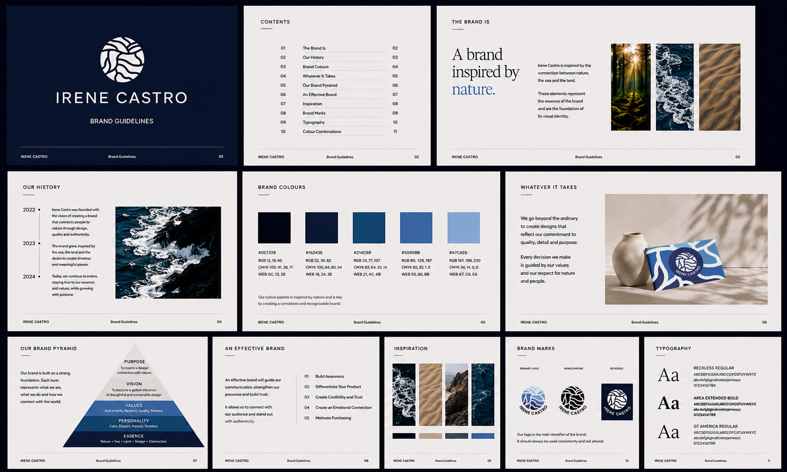
Every rule, every proportion, every relationship — documented for consistency across every surface the brand will ever touch.
"A mark that speaks before the name does."— Creative Direction
Drag to explore