Art Direction & Graphic Design — 2024
A studio identity rooted in nature — botanical illustration, warm colour, and craft built into every brand touchpoint.
Brand Identity
Art Direction
Stationery
2024
Art Direction & Graphic Design — 2024
A studio identity rooted in nature — botanical illustration, warm colour, and craft built into every brand touchpoint.
The Brief
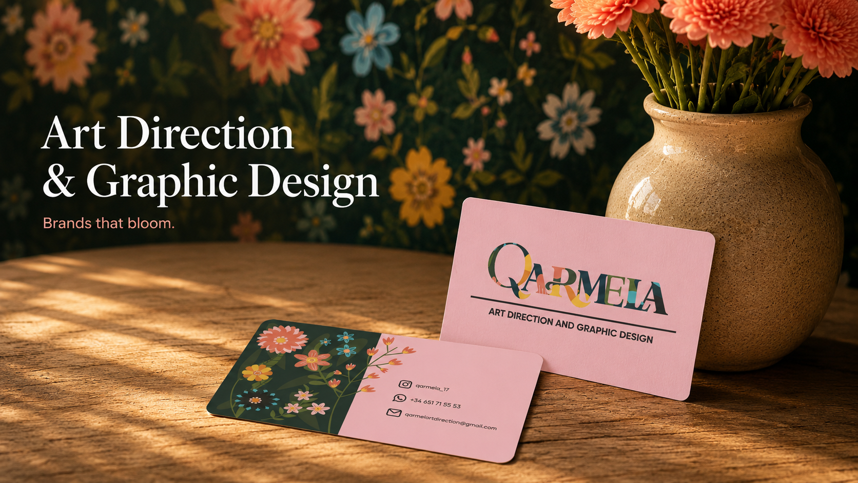
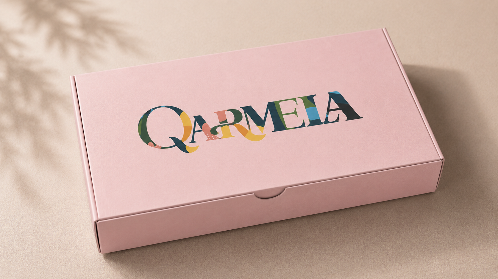
Qarmela needed an identity that felt alive — something that communicated the warmth, craft, and botanical spirit behind the studio without ever feeling generic or cold.
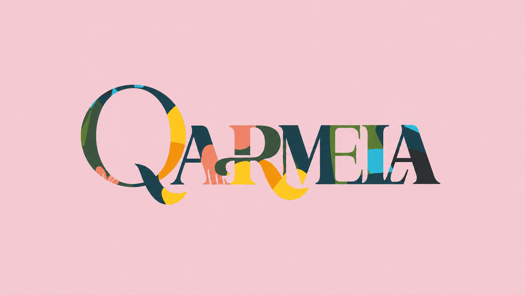
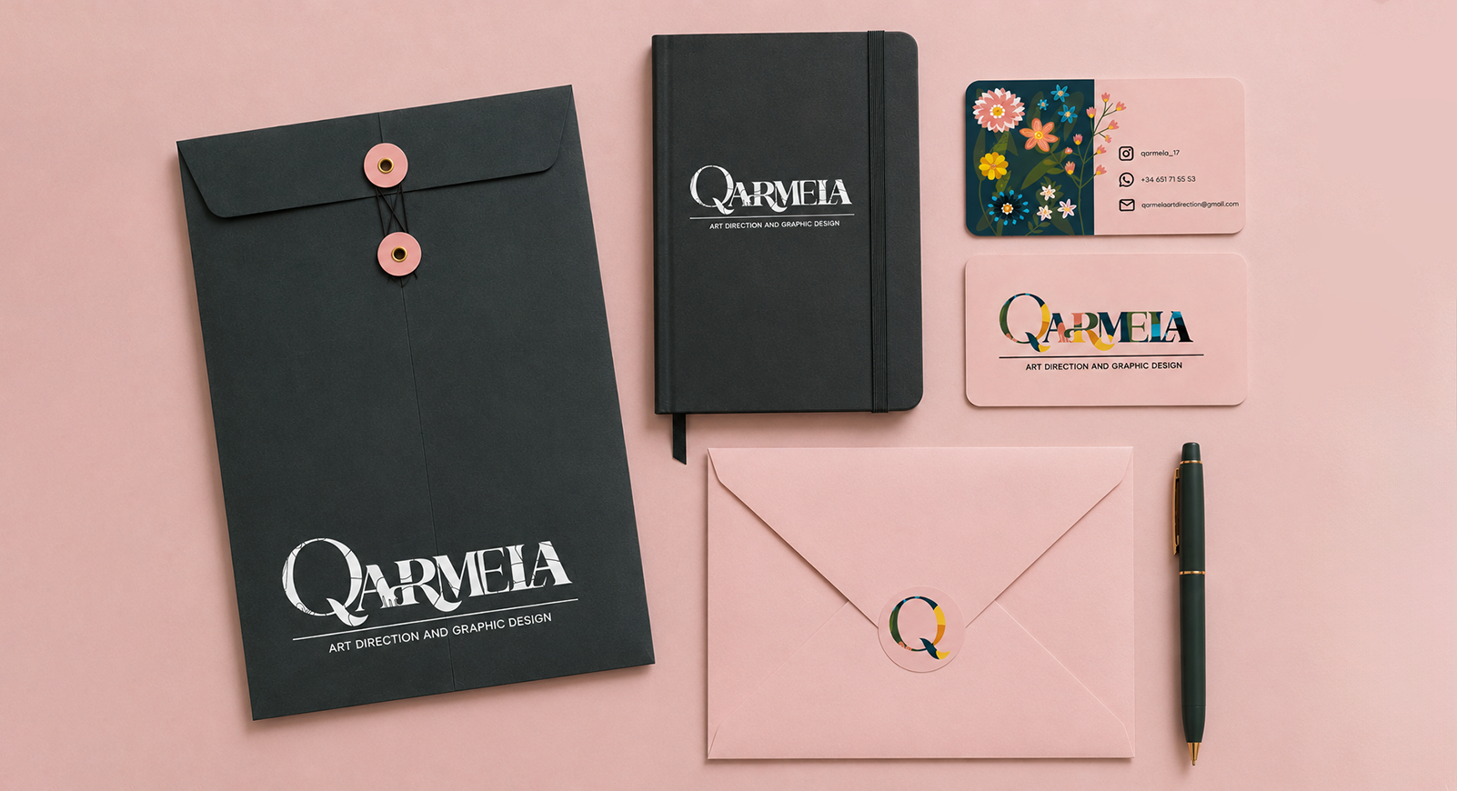
We built a full brand system from the ground up: a hand-crafted wordmark filled with botanical illustration, a flexible icon family, a warm and expressive color palette, and a complete stationery suite designed to delight at every touchpoint.
The result is a brand that feels rooted, refined, and ready to bloom across every application.
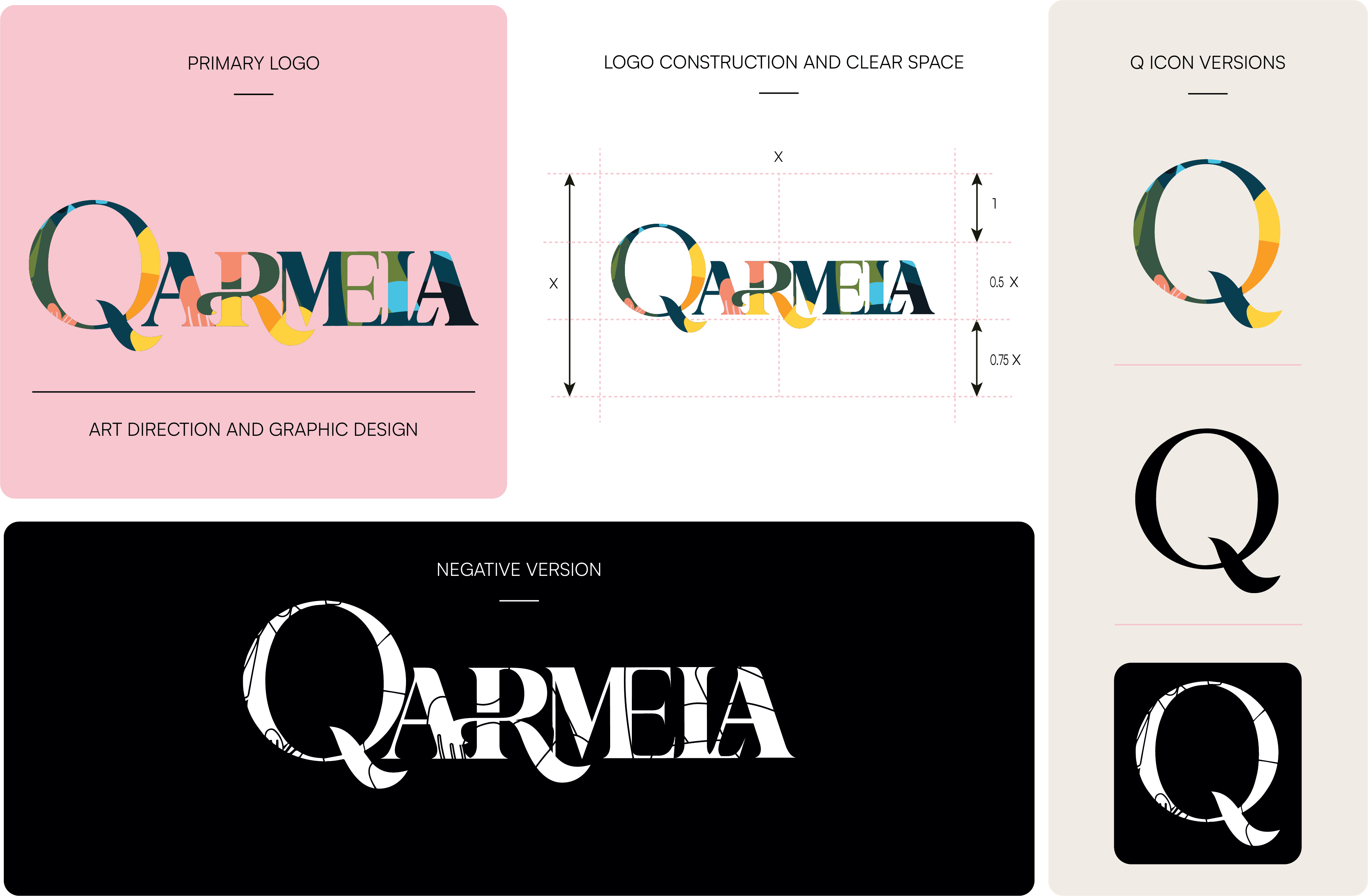
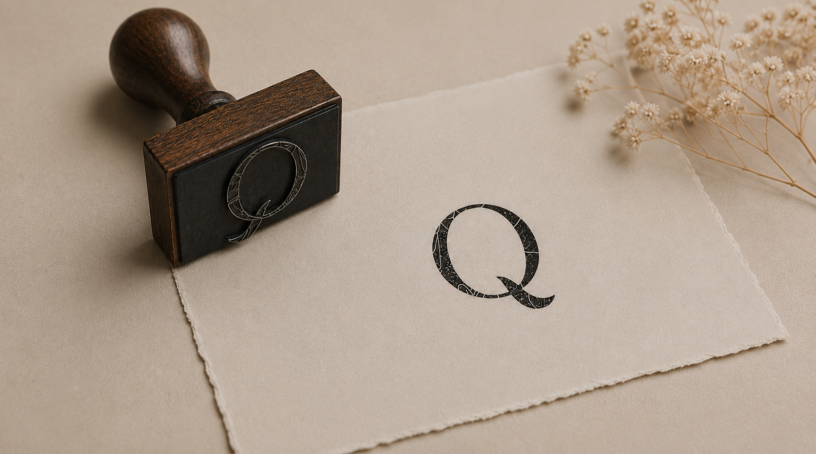
Primary logo, construction rules, and Q icon system across all versions.
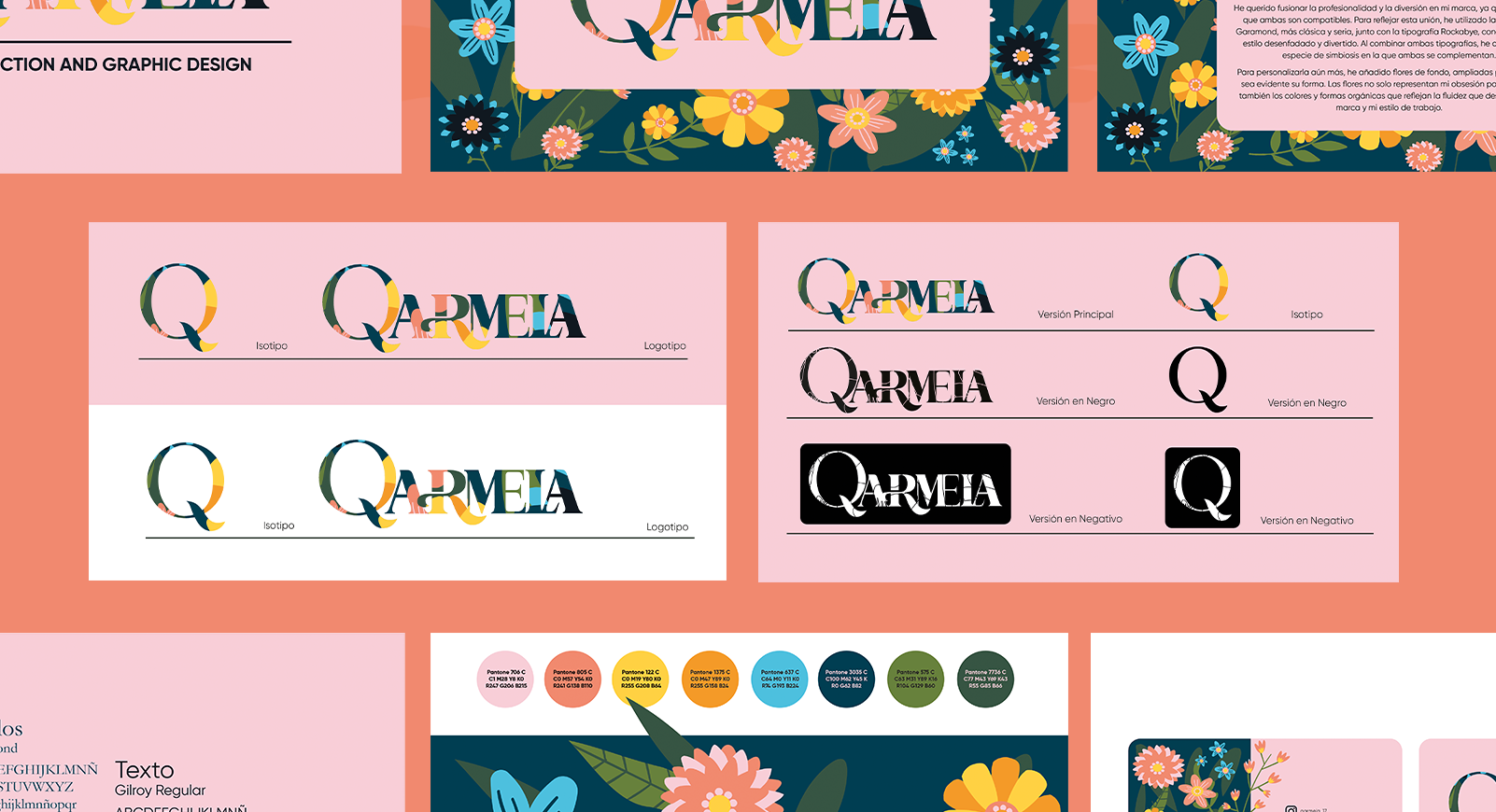
Color palette, typography, and full application across brand touchpoints.
Drag to explore
Vinca Studio — 2024
Every mark we make is built to carry meaning — from the first sketch to the final press.